Holistic Health Platform
Branding / Packaging / Environment
Agency - Happy mcgarrybowen

Background:
Cult was a fitness centre offering intensive functional training. After a year of success, it was bought over by cure.fit— a brand which believes in maximising the human potential of mind and body. They were all set to redefine the health and fitness realm by transforming it into a gradual journey, and Cult became their first offering.
Challenge:
While Cult’s fitness philosophy transitioned to cure.fit’s, the identity was reminiscent of aggression and exclusivity.To create a positive, healthy consumer-transformation, it became imperative to create a feeling of inclusivity – fitness for everyone regardless of gender, age and lifestyle. In order to achieve this, the rebranding exercise needed to begin with the parent brand itself - cure.fit.
Solution:
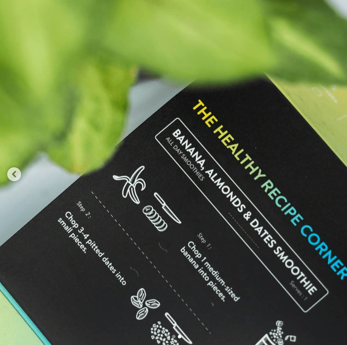
We gave cure.fit a new identity, which was later applied to all of its sub-brands. We renamed Cult to cult.fit, and extended the theme to other sub-brands— eat.fit, mind.fit, etc.
The new logo featured a human form in its raw, unfinished state. It represents the ‘cult human’ as a continuous work in progress. We branded cure.fit to exude positive, friendly energy which could encourage consumers to follow a holistic fitness journey. With the circular form and colourful radiations originating from the core, the logo symbolises a holistic fitness journey and boundless energy that flows out into the world. The tone of voice for the brand was a balance between energy, motivation and compassion.
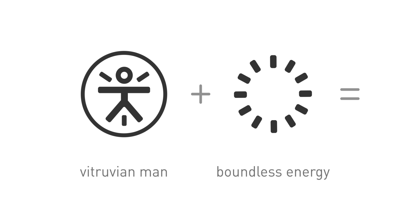
Derivation
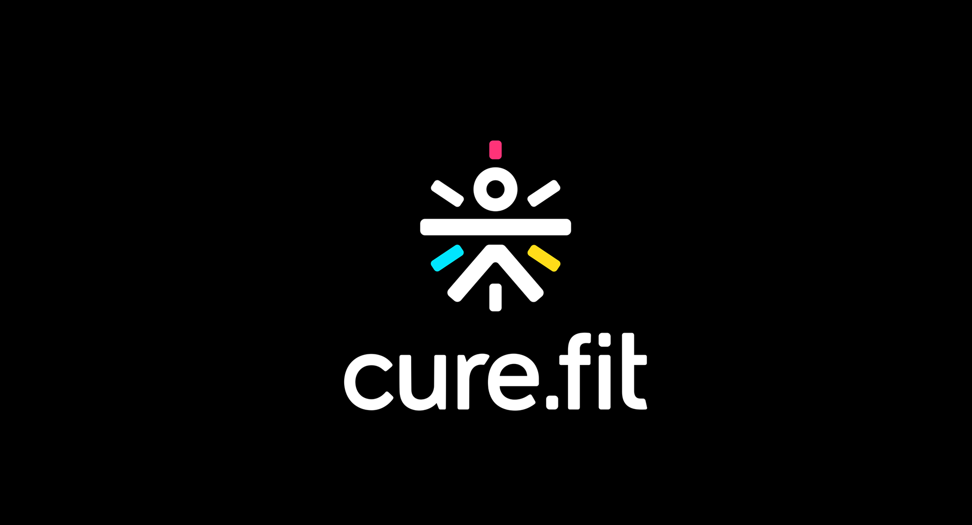
Logo
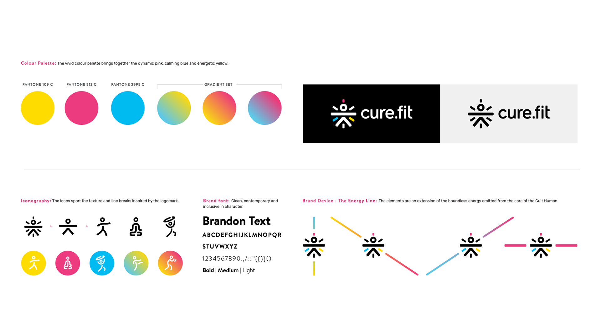
System
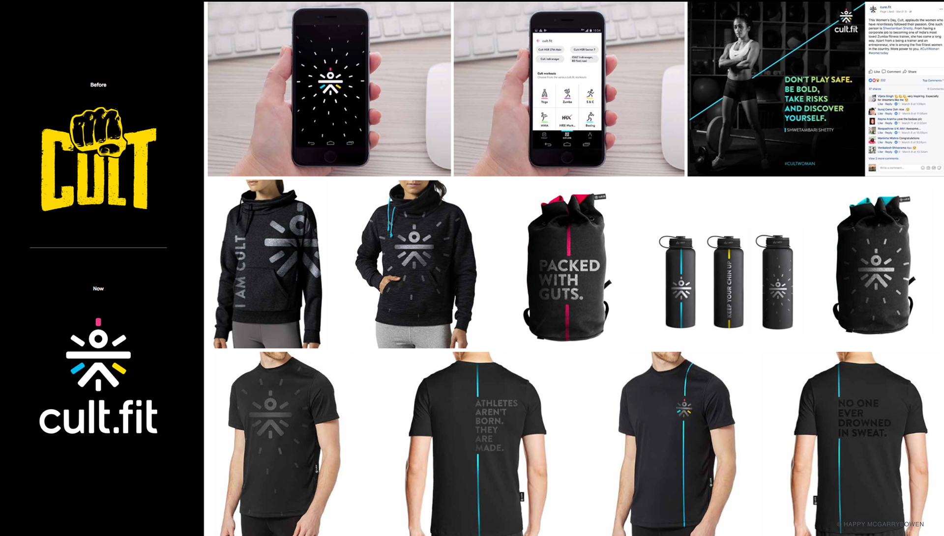
cult.fit rebranding and system
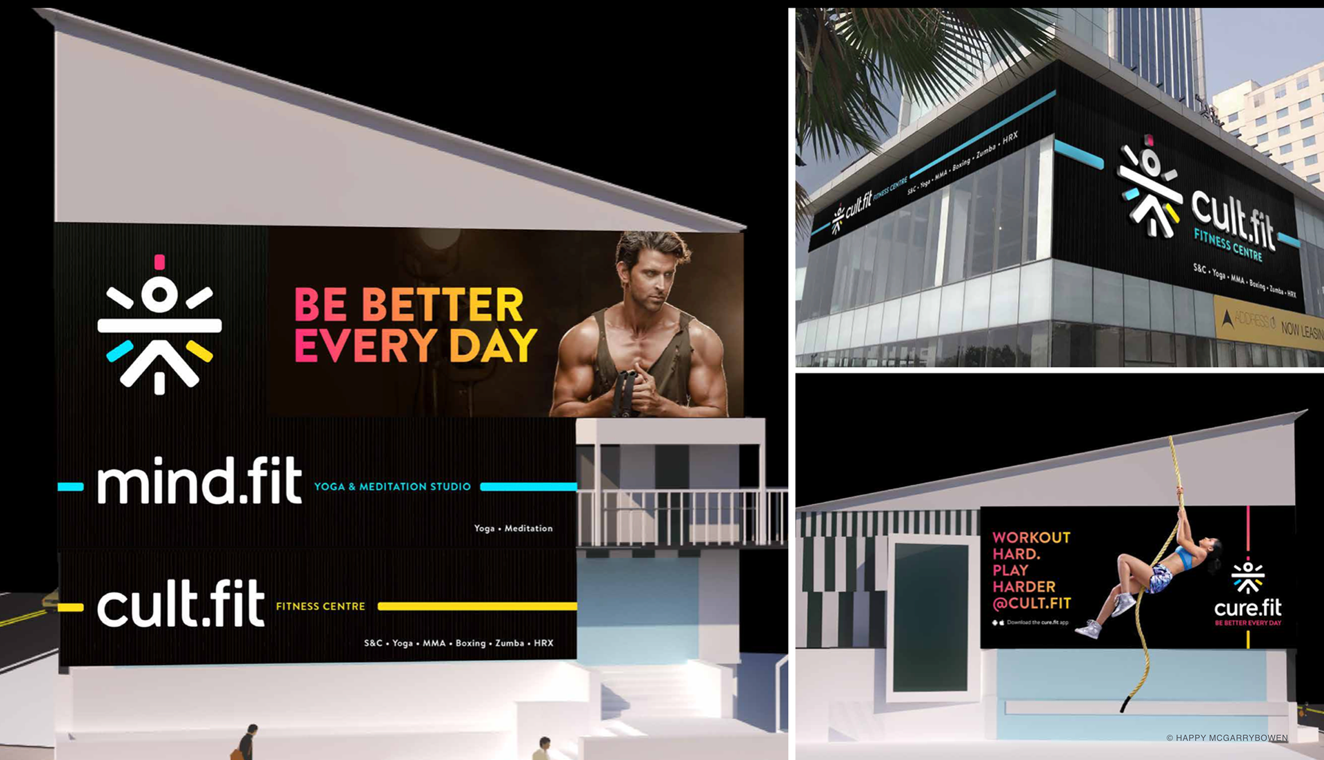
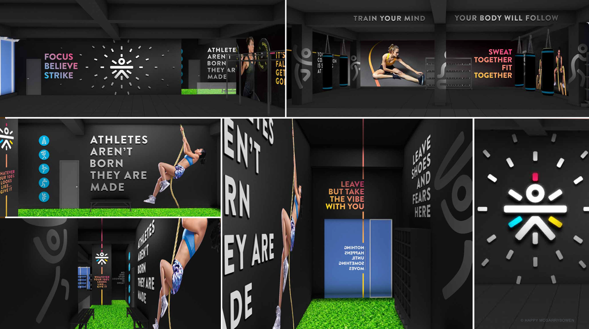
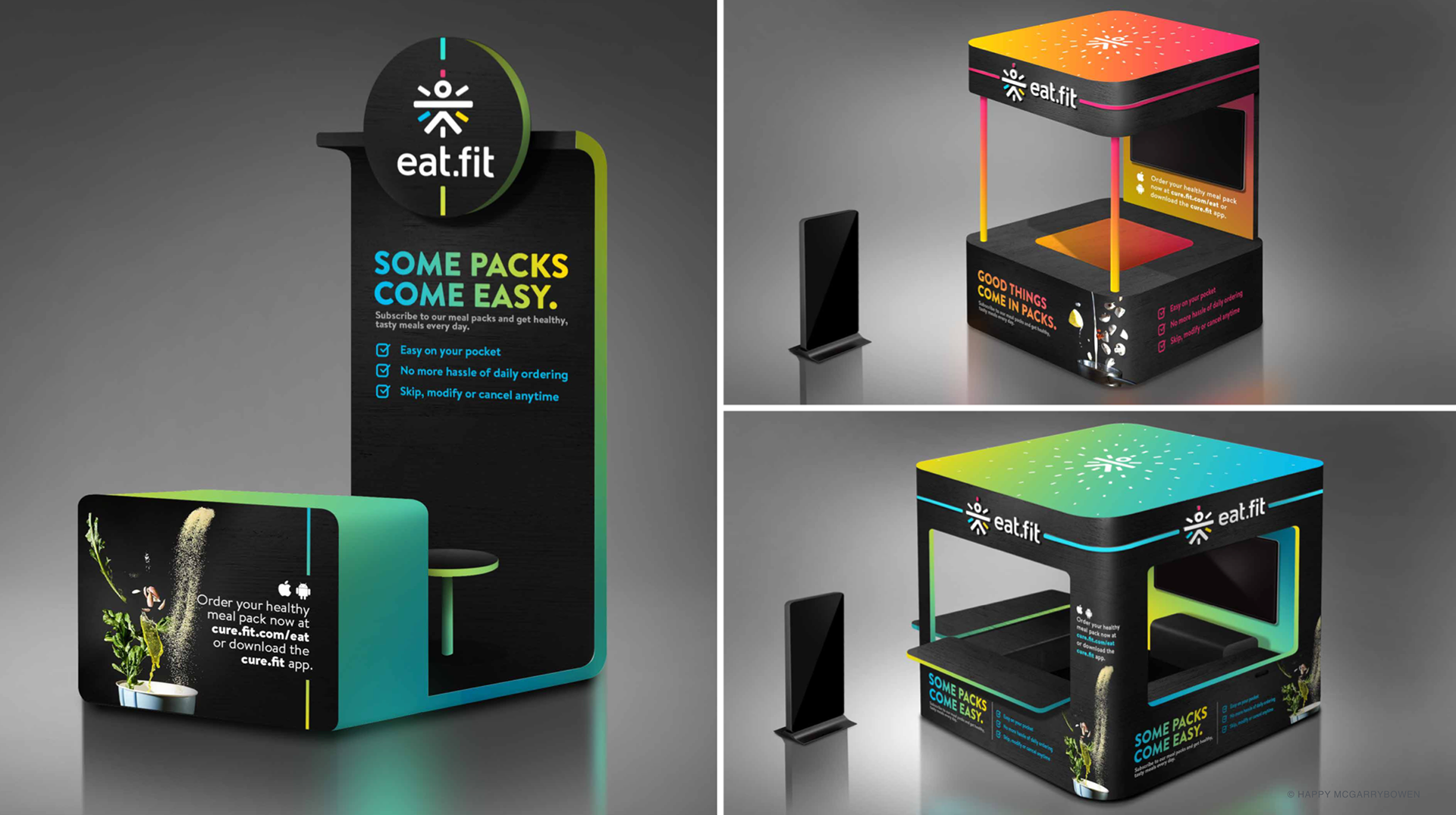
Environment
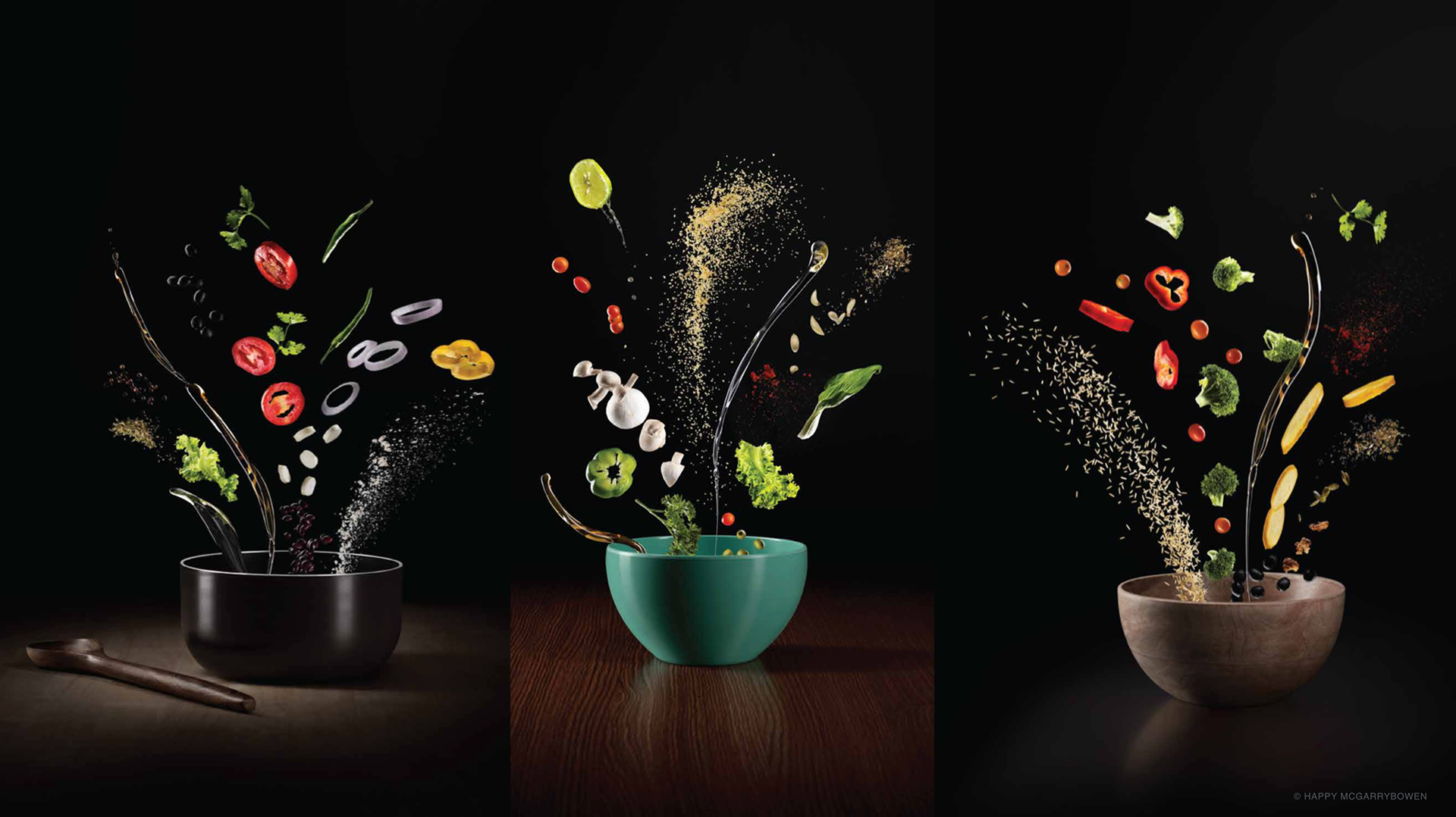
eat.fit system